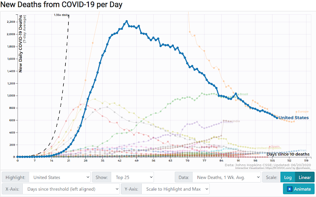
What you may not know is the new deaths have been on the decline--even with the rise in new cases:
Now I graphed this out: New Cases/New Deaths (weekly average) over time.
NOTE: The following graph approximates a trend but is problematic. The deaths could come at any time after someone is diagnosed. It likely would not occur at the same time although it might in a few cases. If I could match the diagnosis with deaths, the graphs would be highly accurate. If I could find the average length of time between diagnosis and death, it would be close. If I get an average, I will modify the graph at that point. However, until that time, this graph should still show the general trend.
Also note that these numbers deal with averages to remove spikes that might be artifacts of differences in reporting. Moreover, the percentages would be lower still if we could factor in those infected by COVID-19 who remained asymptomatic.
It seems that at one point, Day 45, we peaked on the percent [7.6%] of those who contracted and also died, noting the above caveats. The opening numbers probably do not reflect accurate numbers due to the delay between contracting and passing. When I get an accurate average, I will shift the data.
Here's what it would look like if the average death occurred five days after diagnosis (please assume same labels):
Seven days:
Ten days:
As I suspected, the opening parts did not match, but the ending parts do correspond well--numbers approach two or three percent. The numbers for ten days seem to start too steep, so that seems improbable (one out of three patients died at first?), but it isn't our place to question the data until we get a better average.
I'll post a variety of news articles later.


No comments:
Post a Comment